Re-Introducing Delta Kappa Delta: 2021 Brand Refresh
The Delta Kappa Delta that you see today is a new one. From our humble beginnings in 1999, this organization has blossomed in ways no one could have dreamed of. And so, it was time that we showed our new, true selves to the world – with a brand refresh.
This was a long-term project taken on by our 2020-2021 VP of Marketing, Kavya Sebastian, with input from the National Board and National Founding Mother, Rachel Gupta, who designed our original crest in 1999.
A “brand” is so much more than a logo. It is a person’s perception of an organization or experience. It is an ever-evolving and sometimes subjective way of capturing a single mission or purpose.
For Delta Kappa Delta, that means shedding layers of ourselves as we step towards a more equitable, modern version of what it means to be a sxsterhood. This rebrand was a long time coming as we grew massively and impressively year over year.
When we started with 13 founders, our roots of service differentiated us from other Greek-letter organizations – and that remains true. However, over the years, our visual brand identity lost clarity.
And as with any modern day organization, a brand with no vision is stripped of its identity, its mission, its importance. Therefore, the goal of this rebrand was to re-center our purpose of service as it related to all things marketing.
Each element of this project, from the fonts to the color palettes to the new submarks and crest, was designed with thoughtful intention.
We started by working on a complete revamp of our national website. To do this, we needed to re-establish the foundation of our visual brand. Our VP of Marketing used her marketing background to freshen up our color palette and type suite.
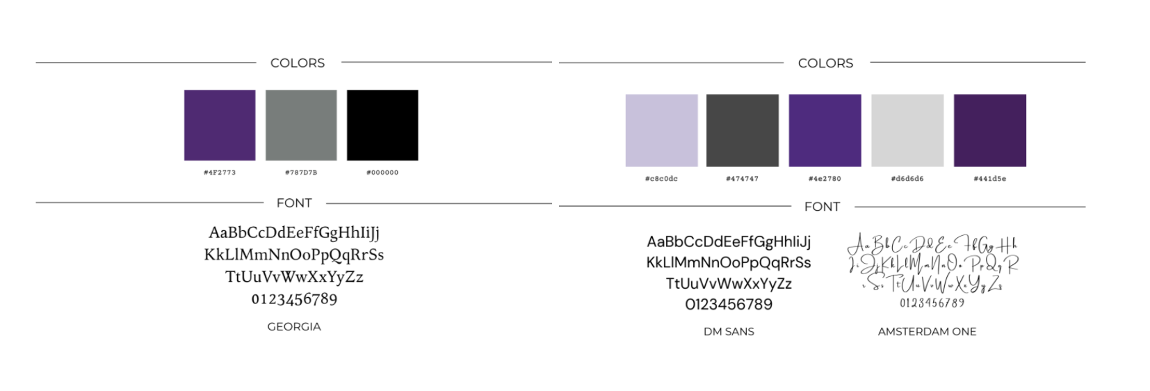
The original color palette was a much darker and dull combination of our violet, black, and silver. However, we took a closer look at the reason our Founding Mothers chose these colors, which inspired us to lighten up the palette by adding more shades of purple, including lavender, a lighter grey, and a less daunting black.
To match this lighter mood, the font moved away from the intimidating look of Serif fonts. Serif refers to the decorative stroke that finishes off the end of a letters stem, also called the “feet” of the letters. Sans serif is the opposite and offers a cleaner, more airy look to a brand. Therefore, after working with some font pairings, we selected DM Sans as our primary font with Amsterdam one to add a whimsical element to the type suite.
This foundation helped design and develop a completely new, from-scratch, national website. We moved to Squarespace to enable a cleaner design while also offering platform options for scalability, such as capacity for an online store (think DKD merchandise) or booking appointments should the need arise as our organization grows.

With a new website, we had just an inkling of the new and improved Delta Kappa Delta visual identity. As a result, our social media and brand assets, such as our crest, felt out of sync with this new direction.
So, with this new palette and type suite, we implemented new Instagram highlights to match the new brand, optimized our Instagram bio to better reach potentially one-day sxsters, and decided to create a submark for use on social media.

A submark is a simplified version of a main logo and a way for a brand to maintain its identity where a full logo may not fit or be appropriate. In the case of our sxsterhood, it was important that we avoid diluting the importance of our crest.
At the time, our organization crest was being used on all marketing materials. We needed something that symbolized us without using the crest so charters could stand out in their graphic design without taking away from the official capacity of things like press releases, National Board announcements, and more.
With a brand foundation in place, our VP of Marketing knew exactly what type of submark we needed: minimalistic, clean, modern. However, our design capabilities were not meeting the vision. After some internal research, reaching out to other Greek organizations, and tapping into our individual professional networks, we landed on Whitney from the Wild Hive Studio.
We collaborated with Whitney to design a submark for our more common marketing materials, like event flyers or social media graphics and decided to focus on the essence of Delta Kappa Delta: the lotus.
Rising through adversity and thriving despite the circumstances is the mark of a true sxster of Delta Kappa Delta. As a secondary logo, this was the perfect addition to our new brand standards.

With all these new changes happening quickly, our visual brand was nearly transformed. To match, we had made significant strides towards building a more diverse and equitable sxsterhood. We reevaluated policy, rewrote parts of our constitution and by-laws, donated over $10,000 to organizations in support of the BLM movement, held programming to focus on mental health, and shifted our entire organization to run online.
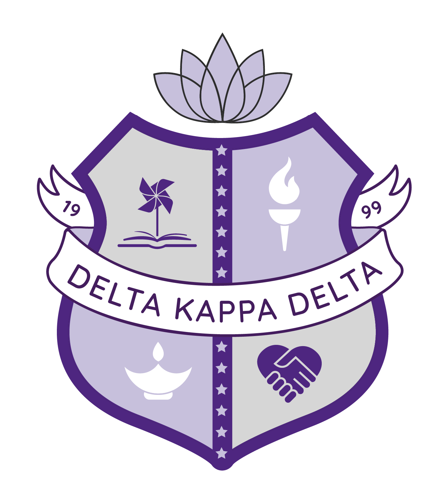
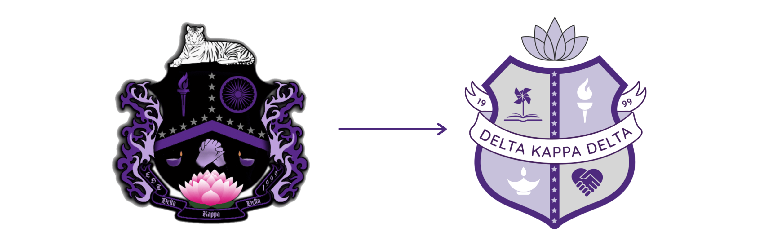
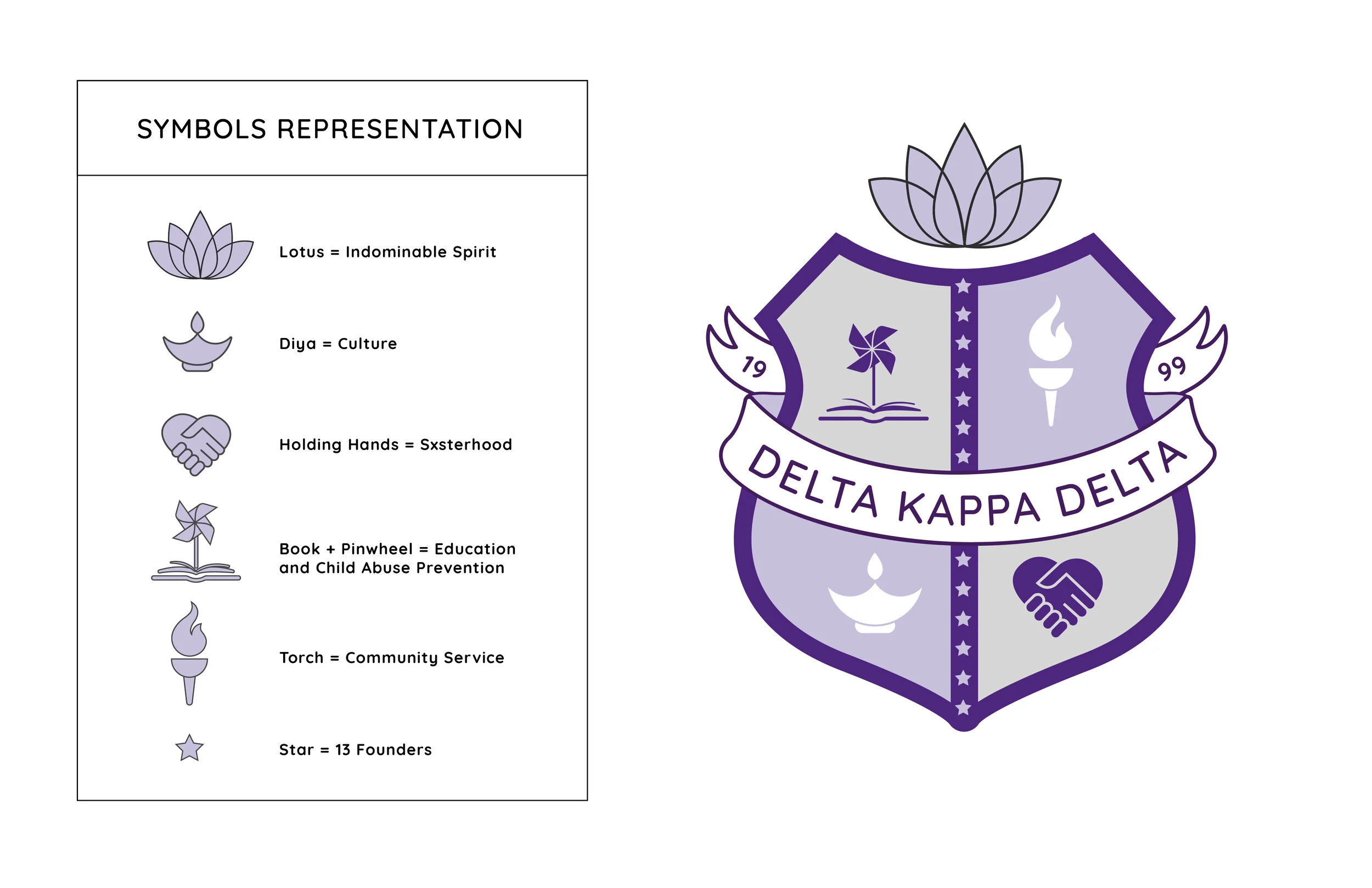
And yet, our crest was out of alignment. In our original crest, we had 14 stars to represent the B.E.T.I.S. with 13 founders of Delta Kappa Delta; crest icons with repeated and redundant meanings; the Ashoka Chakra from the Indian flag for an organization aiming to be more inclusive...
Over the years, our beloved crest became outdated.
Our rebrand involved us taking a critical look at what the symbol of our sxsterhood was really showcasing. So, we removed icons that were repetitive or strayed from the essence of Delta Kappa Delta: the Bengal tiger, the two-tone flames, the chakra.
We held on to the symbols of our pillars – education, culture, community service, indomitable spirit, and sxsterhood – and added a tribute to our philanthropy and service focus with a custom icon.
With each phase of the rebrand, we looked not just at who we have become as an organization, but who we hope to be. This brand refresh was so much more than a new crest or a new set of colors and design guidelines.
It symbolizes a new era of Delta Kappa Delta – and we can’t wait to watch it unfold.
Check out our new Brand Book HERE to see how our new brand strategy was implemented across different areas of our marketing efforts.